
Quick Overview
Choosing the best AI for analyzing scientific figures and complex charts depends on the type of research, chart, and level of accuracy you need. This guide compares leading tools such as Claude, ChatGPT, Gemini, NotebookLM, SciSpace, and Elicit, covering their strengths, limitations, use cases, and ability to understand charts, figures, and research papers.
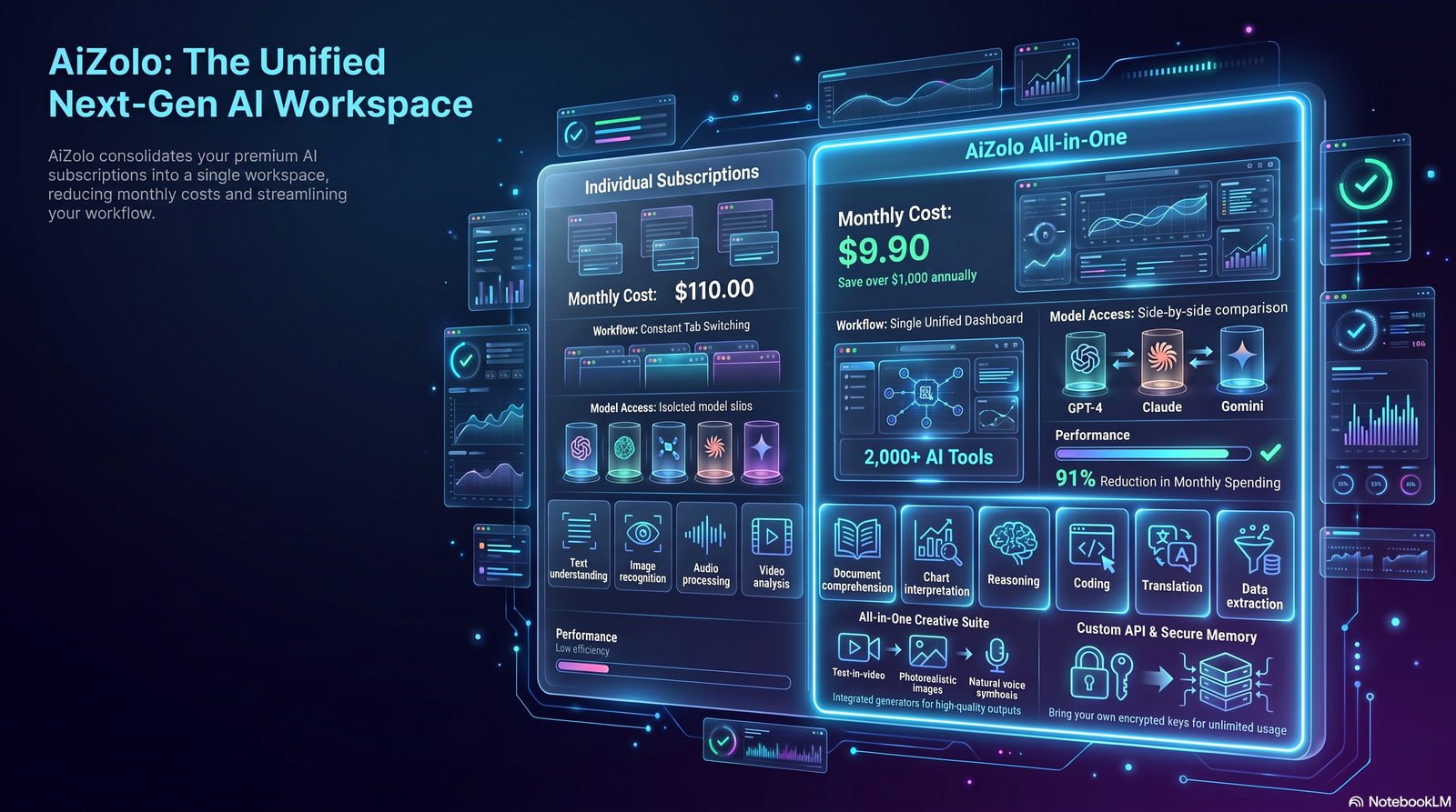
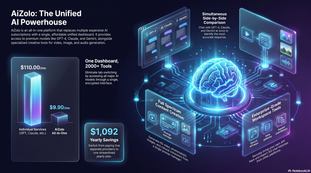
If you want to compare different AI models for visual and research tasks without managing multiple platforms, AiZolo provides a convenient workspace where you can access and switch between multiple AI models, making it easier to find the model that works best for your specific task.
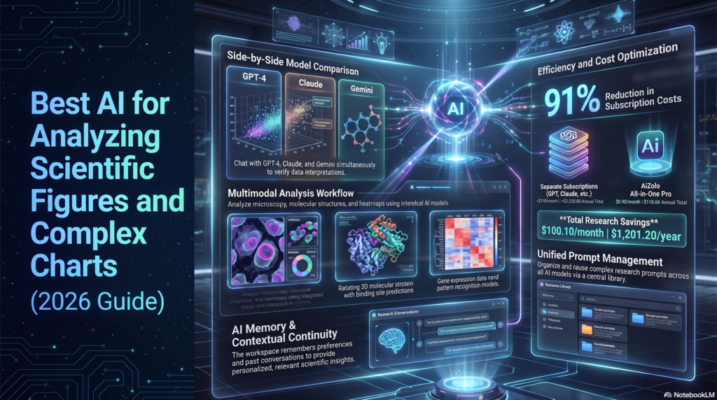
Table of Contents
Introduction
A researcher today can produce in one afternoon what used to take a week: a multi-panel figure with six sub-plots, a heatmap, and a Kaplan–Meier curve, all destined for a paper that a reviewer will skim in minutes. Reading figures fast — and correctly — has become its own bottleneck.
That’s the gap AI is stepping into. Multimodal models can now look at a scatter plot, a western blot, or a patent diagram and describe what’s actually in it, not just the pixels around it. That’s a meaningfully different skill from older OCR, which could read the axis labels but had no idea what a Kaplan–Meier curve means.
This guide is a practical comparison of the AI tools researchers, students, and analysts actually reach for when they need to interpret a chart, extract numbers from a figure, or double-check what a plot is telling them — including where each one is genuinely useful and where it will confidently get you wrong.
You’ll find tool-by-tool breakdowns, comparison tables, use-case recommendations, a reader-run evaluation method, and answers to the questions researchers ask most often about AI for analyzing scientific figures and complex charts. Whether you’re comparing standalone tools or an all-in-one platform like Aizolo, this guide helps you make an informed decision based on real research needs.
What Makes an AI Good at Scientific Figure Analysis
Not every “AI that reads images” is built for this job. The tools worth using for scientific figures tend to share a few traits:
- Chart-type recognition — telling a box plot apart from a violin plot, a forest plot apart from a dot plot, before attempting any interpretation.
- Axis and legend parsing — reading units, scales (log vs. linear), and legend mappings correctly, not just recognizing text exists.
- Numerical estimation from pixels — approximating data values from bar heights or point positions, with appropriate uncertainty.
- Domain context — recognizing that a volcano plot implies differential expression analysis, or that a Bland-Altman plot implies a measurement-agreement study.
- Willingness to say “I’m not sure” — the single biggest differentiator between a useful research aid and a liability, because a confidently wrong number in a systematic review is worse than no number at all.
Expert Tip: When testing any AI on a figure, ask it to state its confidence and what part of the image it’s uncertain about. Tools that never express uncertainty are the ones to double-check hardest.
Why Traditional OCR Is Not Enough
Classic OCR was built to turn pixels into characters. It’s excellent at reading a figure’s caption or axis numbers. It has no concept of what a Kaplan–Meier curve represents, why two lines diverging matters, or that a shaded band is a confidence interval rather than decoration.
Chart-specific extraction models (like DePlot, used as a research baseline) improved on this by learning chart structure directly — but they’re typically trained on business-style bar and line charts, not the long tail of scientific chart types: flow cytometry plots, forest plots, gel images, or multi-panel figures with insets.
That’s the gap multimodal, vision-language models (VLMs) — the kind behind ChatGPT, Claude, and Gemini — are increasingly closing, because they combine visual pattern recognition with broad scientific and statistical knowledge learned from text.
A 2026 open-source study, PlotPick, evaluated six vision-language models against the dedicated chart-to-table model DePlot on two established benchmarks (ChartX and PlotQA).
Across both benchmarks, all six VLMs outperformed DePlot, and on the ChartX subset restricted to bar charts, line charts, box plots, and histograms, the VLMs achieved 88 to 96 percent recall compared with 71 percent for DePlot.
That’s the clearest independent evidence available right now that general-purpose multimodal AI has overtaken purpose-built chart-extraction models on at least some chart types — though it also means even the best models still miss data points a meaningful fraction of the time, which is why manual spot-checking remains necessary for anything going into a published analysis.
Research Insight: “Better than dedicated chart-extraction models” is not the same as “reliable enough to skip verification.” Treat AI-extracted numbers as a fast first draft, not a final dataset.
How Multimodal AI Understands Charts
Modern multimodal models process an image and text prompt together through a shared architecture, rather than running OCR and a separate captioning model in sequence.
In practice, that means you can ask follow-up questions — “what’s the p-value implied by this figure,” “does panel C support the claim in the abstract” — and the model reasons over the image and your question together instead of returning a fixed, generic caption.
This is genuinely useful for:
- Distinguishing chart types and applying the right interpretive frame to each
- Cross-referencing a figure against surrounding text when you upload the full PDF
- Flagging visually misleading elements, like a truncated y-axis exaggerating a difference
It’s genuinely not a substitute for:
- Precise numerical extraction where exact values matter (always verify against source data or supplementary files when available)
- Domain expertise the model wasn’t trained deeply on (rare assay types, niche instrumentation outputs)
- Statistical judgment about whether a result is actually significant or meaningful
Best AI for Analyzing Scientific Figures and Complex Charts: Top Picks
These are the tools researchers most commonly reach for, based on current product documentation, independent reviews, and how each is actually used in practice as of mid-2026. Pricing and feature details shift often for AI products — verify current numbers on each provider’s site before publishing.
1. Claude (Anthropic)
Overview: Claude handles image uploads (including scientific figures) and long PDFs in the same conversation, and independent evaluations through 2026 have repeatedly found it among the most conservative major models about stating uncertainty rather than guessing — a meaningful advantage for figure interpretation, where a confidently wrong number is worse than an honest “I can’t tell from this image.”
Strengths: Strong at reasoning across a full paper (upload the PDF, then ask about a specific figure in context); tends to flag when it’s extrapolating versus reading directly off the chart; large context window supports multi-figure comparison within one document.
Weaknesses: Claude does not generate images, and its native audio/video understanding lags competitors — irrelevant for static figures, relevant if your workflow also involves recorded talks or video microscopy.
Ideal users: Researchers who need to cross-reference a figure against the surrounding methods and results text, and who want a tool that’s more likely to decline than to fabricate.
Privacy considerations: Check current data-handling terms for your plan tier before uploading unpublished data; consumer and enterprise tiers have different retention policies.
2. ChatGPT (OpenAI)
Overview: ChatGPT’s vision capability, paired with Code Interpreter/Advanced Data Analysis, lets you upload a chart image and then ask it to also write Python to re-derive or re-plot the data — useful when you want both an interpretation and a reproducible extraction script in the same session.
Strengths: Tight loop between “describe this figure” and “now write code to extract/re-plot it”; broad plugin and connector ecosystem; strong at general chart types (bar, line, scatter).
Weaknesses: Independent 2026 comparisons have generally placed ChatGPT’s hallucination rate somewhat above Claude’s on factual/citation tasks, though the gap narrows or reverses depending on which benchmark and model version is tested — treat any single number from these comparisons as a snapshot, not a permanent ranking.
Ideal users: Users who want figure interpretation and quick data re-extraction into code or a spreadsheet in one workflow.
3. Gemini (Google)
Overview: Gemini‘s native multimodal design and Google Search grounding are a real advantage for figures tied to very recent publications, and its integration with Google Workspace (Docs, Sheets) makes moving extracted data into a working spreadsheet fast.
Strengths: Large context window for multi-paper comparison; strong native video/image understanding if your workflow includes recorded lectures or supplementary video; Workspace integration.
Weaknesses: Several 2026 hallucination benchmarks found Gemini models score well on raw knowledge but relatively high on confident fabrication when uncertain — a pattern worth knowing before trusting an unverified number it gives you.
Ideal users: Researchers already living in Google Workspace, or anyone needing to tie a figure to breaking/very recent literature.
4. NotebookLM (Google)
Overview: A source-grounded tool — it answers only from documents you upload, not general training knowledge, which meaningfully reduces the risk of it inventing information not present in your paper.
Strengths: Citation tracking back to your uploaded source; good for comparing methodology across several uploaded papers at once; audio-overview feature for reviewing findings hands-free.
Weaknesses: Focuses primarily on note-taking rather than comprehensive figure-level analysis, and offers limited collaboration features. Less suited to open-ended, exploratory chart interpretation than general chat tools.
Ideal users: Students and researchers who want grounded, citation-linked answers restricted strictly to their own uploaded papers.
5. SciSpace (Chat with PDF)
Overview: A research-specific tool for uploading a paper and asking questions directly against its content, including tables and figures, with answers linked back to the source location.
Strengths: Parses an uploaded document and answers directly from the text, which reduces (though doesn’t eliminate) hallucination risk versus general chat tools; multilingual support; large indexed paper database for cross-referencing.
Weaknesses: Less suited for large-scale systematic comparisons across many documents — it’s built for depth within a single paper rather than breadth across hundreds. Like any AI tool, it can still hallucinate information or fabricate references, so citations should always be checked.
Ideal users: Anyone doing close reading of one paper at a time — students working through a dense methods section, or reviewers checking a specific figure’s claims.
6. Elicit
Overview: Built for structured literature review and evidence extraction rather than single-figure interpretation, but relevant when your “figure analysis” task is really “pull comparable results tables across 50 papers.”
Strengths: The only mainstream AI research tool with a true systematic-review screening pipeline, offering structured inclusion/exclusion criteria and threshold-based filtering across a very large paper database.
Weaknesses: Not designed for deep single-figure visual interpretation; best paired with a general vision-capable tool for the actual chart-reading step.
Ideal users: Systematic reviewers who need to extract comparable data points from many papers’ results figures/tables at scale.
7. Purpose-built chart-extraction tools (e.g., PlotPick and similar VLM-based extractors)
Overview: Open-source and specialized tools built specifically to batch-convert chart images into structured tables, rather than to hold a conversation about them.
Strengths: Designed for the exact meta-analysis use case of “I have 40 papers and need the numbers behind each bar chart”; batch processing beats manually querying a chatbot 40 times.
Weaknesses: Narrower scope than general chat tools — usually chart-to-table only, not broader interpretation, context-linking, or write-up help.
Ideal users: Meta-analysts and systematic reviewers doing bulk numerical extraction from many figures.
Comparison Table: Core Capabilities
| Tool | Best for | PDF upload | Chat follow-up on figures | Code/data export | Source-grounded citations | Free tier |
|---|---|---|---|---|---|---|
| Claude | Cross-referencing figures with full-paper context | Yes | Yes | Limited | Partial | Yes (limited) |
| ChatGPT | Interpretation + re-plotting/extraction code | Yes | Yes | Yes (Code Interpreter) | Partial | Yes (limited) |
| Gemini | Recent papers, Workspace workflows | Yes | Yes | Via Sheets/Docs | Partial (Search-grounded) | Yes |
| NotebookLM | Strictly source-grounded Q&A | Yes | Yes | Limited | Yes | Yes |
| SciSpace | Deep single-paper reading | Yes | Yes | Limited | Yes | Yes (limited) |
| Elicit | Cross-paper structured extraction | Yes (bulk) | Limited | Yes (tables) | Yes | Yes (limited) |
| Chart-extraction VLM tools | Batch numeric extraction | Varies | No | Yes (structured tables) | N/A | Varies (often open-source) |
Pricing changes frequently — confirm current tiers directly on each provider’s pricing page before publishing.
Best AI by Use Case
Best for Researchers: Claude or SciSpace — strong figure-in-context reasoning and lower tendency to fabricate when uncertain.
Best for Students: NotebookLM or SciSpace — source-grounded answers reduce the risk of learning something the paper never actually said.
Best for Medical Imaging figures (histology, radiology-adjacent charts): Use general-purpose tools only for descriptive orientation, never for diagnostic interpretation — this is a hard line, not a preference. See the callout below.
Best for Engineering Charts: ChatGPT — tight loop between interpretation and re-derivation via code.
Best for Biology (western blots, flow cytometry, volcano plots): Claude or ChatGPT for interpretation, paired with manual verification against raw data files.
Best for Chemistry (spectra, chromatograms): General vision-capable chat tools can describe peak patterns, but numeric peak values should always be re-checked against instrument software output.
Best for Academic Papers: SciSpace or Elicit for grounded, citation-linked reading.
Best for PDF Figure Extraction: Chart-extraction VLM tools for batch work; Claude or ChatGPT for one-off figures.
Best Free Tools: NotebookLM, and the free tiers of Claude, ChatGPT, and Gemini all support basic figure upload and interpretation.
Warning: For any figure tied to a medical, legal, or safety-critical decision, AI output is a starting point for a qualified human reviewer — not a substitute for one. Multiple 2026 healthcare-safety assessments have specifically flagged general-purpose AI chatbots as unvalidated for clinical use.
Paid vs. Free: What Actually Changes
Paid tiers across Claude, ChatGPT, Gemini, and NotebookLM mainly raise usage limits, context-window size, and access to the newest model version — details that shift often and aren’t unique to figure work. For a full side-by-side of current pricing, context windows, and model tiers, see our complete AI model comparison. For occasional figure-checking, the free tier of any major model is usually enough.
How to Evaluate These Tools Yourself
Rather than trusting any single article’s benchmark claims (including this one), run this quick test before committing to a tool for serious work:
- Pick 10–15 figures from your own field, spanning at least 3–4 chart types you actually work with (e.g., scatter, heatmap, forest plot, gel image).
- Ask each candidate tool to describe the figure and extract 3–5 specific numeric values.
- Compare extracted numbers against the source data (raw files, supplementary tables, or your own careful manual read).
- Note where the tool expressed uncertainty versus where it stated a wrong number confidently — the second pattern is the dangerous one.
- Repeat with a chart type the tool is likely unfamiliar with (e.g., a niche instrument output) to see how gracefully it fails.
This gives you evidence specific to your own figures and field, which generic benchmark tables — including any you’ll find in “best AI” articles — can’t fully replicate.
Best Practice: Keep a short log of which tool got which figure type right. Over a few weeks this becomes a more reliable guide than any single comparison article.
Information Gain: Chart Types Worth Special Attention
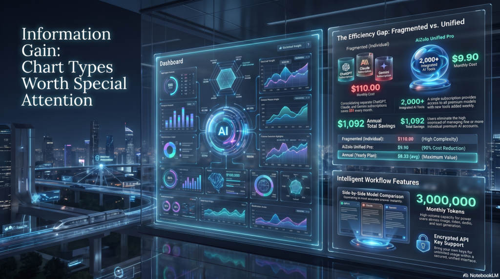
Hallucination risk rises with chart complexity and unfamiliarity. Multi-panel figures with insets, unconventional axis choices, or field-specific conventions are where AI tools are most likely to guess.
Reproducibility: if AI-extracted numbers will feed into your own analysis, document the tool, version, and prompt used — this is now considered good practice for reproducible workflows, similar to documenting a software version.
Confidence intervals: AI tools often correctly identify a shaded band as a CI but can misstate what confidence level it represents if it’s not labeled — always verify against the caption or methods text.
Microscopy and western blots: these benefit most from domain-context prompting (tell the model what stain/antibody/marker is expected) rather than a bare image upload.
Scatter plots, forest plots, Kaplan–Meier curves, volcano plots, heatmaps, flow cytometry plots: all readable in broad strokes by current multimodal models, but exact numeric readouts (hazard ratios, fold-changes, cell percentages) should be treated as estimates pending verification.
Geological charts, satellite imagery, patent figures: more niche domains where model training coverage is less certain — expect more hedging or outright misses, and lean harder on manual verification.
Data privacy — HIPAA/GDPR: Do not upload figures containing identifiable patient data or other regulated personal data to consumer-tier AI tools unless your organization has a specific, compliant enterprise agreement covering that use. This applies regardless of which tool you choose.
Common Mistakes
- Trusting a single AI-extracted number without cross-checking against source data
- Uploading regulated or unpublished sensitive data to a consumer-tier tool without checking its data-handling terms
- Assuming a tool that’s great at bar charts is equally reliable on a forest plot or flow cytometry plot
- Not disclosing AI assistance where your journal or institution requires it
- Treating a confident-sounding description as evidence of accuracy
Limitations of AI Figure Analysis (Right Now)
- Exact numeric extraction remains an estimate, not a measurement, in most cases
- Rare or field-specific chart conventions reduce reliability
- Hallucination risk rises with model uncertainty and figure complexity — see PlotPick’s own finding that even the best-performing VLMs did not achieve perfect recall on standard chart benchmarks
- No current mainstream tool is validated as a medical device or substitute for expert domain review
Future of Scientific Figure AI
Expect three trends to matter most over the next year: wider adoption of source-grounded tools that limit answers strictly to uploaded documents (reducing fabrication risk), growing journal acceptance of disclosed AI assistance in figure preparation and review, and continued improvement of specialized chart-to-table extraction models narrowing the gap with (or continuing to trail) general-purpose multimodal AI on niche chart types.
People Also Ask
Can AI accurately read numbers off a scientific chart? It can produce a reasonable estimate for many common chart types, but exact values should be verified against source data. Independent 2026 benchmark work found leading vision-language models beat a dedicated chart-extraction model on standard tests, but none reached perfect accuracy.
Is it safe to upload unpublished research figures to ChatGPT, Claude, or Gemini? Check the specific data-retention and training-use terms for the tier you’re using. Consumer and enterprise/business tiers often have different policies, and terms change — verify current policy before uploading anything sensitive or unpublished.
Which AI has the lowest hallucination rate for scientific data? Hallucination-rate rankings shift across benchmarks and model versions, so treat any single number as a snapshot. We cover how Claude, ChatGPT, and Gemini compare on accuracy and confidence more broadly in our guide on how these models compare on research accuracy. For figure-reading specifically, the safest approach is still to have the model flag its own uncertainty and verify anything numeric against source data.
Can AI read microscopy images or western blots? General-purpose multimodal AI can describe visible bands, structures, or staining patterns in broad terms, but it is not a validated diagnostic or quantification tool — always verify against your actual assay data.
What’s the difference between OCR and AI chart interpretation? OCR extracts text (axis labels, captions). Multimodal AI additionally reasons about what the chart’s structure and values mean, which is why it can answer interpretive questions OCR alone cannot.
Do journals allow AI-assisted figure analysis? Policies vary by publisher and are evolving; some now explicitly permit disclosed AI assistance with figures while requiring authors to verify accuracy. Always check your target journal’s current policy.
Is a free AI tool good enough for occasional figure checking? For basic interpretation and orientation, generally yes. For systematic, high-volume, or publication-bound extraction, a paid tier’s higher limits and features are usually worth it.
Can AI extract data from a scatter plot into a spreadsheet? Yes, approximately — tools like ChatGPT’s Code Interpreter or dedicated chart-extraction tools can output structured estimates, which should then be spot-checked against source data.
What’s the best AI for a systematic review that needs data from hundreds of figures? A batch chart-extraction tool paired with a structured-review tool like Elicit for organizing and screening is typically more efficient than manually querying a chatbot for each figure.
Can AI tell if a chart’s axis is misleading? Yes — this is one of the more reliable capabilities, since detecting a truncated y-axis or unusual scale is a pattern-recognition task multimodal models handle reasonably well.
Does AI understand statistical significance shown in a figure? It can often correctly identify significance markers (asterisks, p-value annotations) but shouldn’t be trusted to independently judge whether a result is meaningful — that requires the full methodology, which the figure alone doesn’t provide.
Should I disclose AI use when interpreting figures for a paper I’m writing? Check your target journal and institution’s policy — disclosure requirements for AI-assisted analysis are becoming more common and vary by publisher.
Final Verdict
- Best Overall: Claude — strong figure-in-context reasoning and a documented tendency toward flagging uncertainty rather than guessing.
- Best Free: NotebookLM — strictly source-grounded, reducing fabrication risk at no cost.
- Best for Researchers: Claude or SciSpace, depending on whether you need broad reasoning or deep single-paper grounding.
- Best Value: The free tiers of the major chat tools, for occasional use; a paid tier once volume increases.
- Best Enterprise: Whichever provider’s enterprise data-handling terms match your institution’s compliance requirements — check this before capability.
- Best Academic Workflow: SciSpace or Elicit for literature-grounded reading and extraction, paired with a general vision tool for figure-level detail.
Next steps: Run the five-step evaluation checklist above on figures from your own field before committing to one tool for ongoing work.
Author
Jeevesh Tripathi — AI Research & SEO Content Specialist Email: jeevesh@aizolo.com
1